
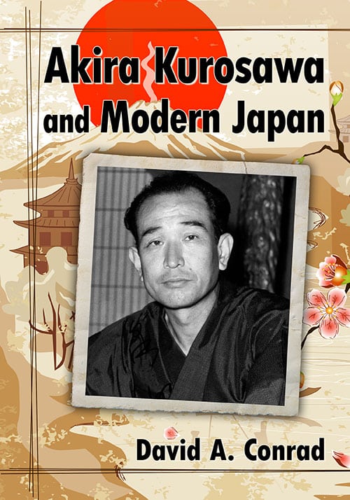
Kurofan postcard of Kurosawa colourised
-
22 November 2013
Vili
24 November 2013
Ugetsu
They are lovely. I don’t see the point in colourising films which were very much designed for monochrome (e.g. Rashomon), but I assume that for many of the earlier films it was a budgetary and technical rather than artistic decision to go for B&W. I’ve often wondered what Seven Samurai would be like in colour. Some of the battle scenes (as with Ran) could have been even more spectacular, except maybe he would have gone for bright sunshine rather than rainy murk as the default setting of those fights.
12 December 2013
glenistour

🙂 Thanks.
In fact Kurosawa could have filmed in color since 1953.
But he claimed to hate the color quality “not japanese enough”.
Having seen Gate of hell (first japanese film in color) I agree with him.
I understand people against the process to turn B&W movies to color movies.
I did this stuff just for fun. I just considered that many Kurosawa fans would find this amazing.
It’s quite strange indeed that no studios converted Seven Samurai to a color version yet.
This nice postcard is free to print, and dedicated to the memory of Penny N Vilela who was a great Kurosawa fan and a dear friend.
Have a nice day,
Guillaume Le Nistour.
14 December 2013
Vili
Indeed, the early Japanese colour film quality was apparently not up to a satisfactory level for Kurosawa. It was also a big technical challenge for auteur directors, as they had to change so much of their approach when it came to set design and lighting when switching to colour.
Even what was supposed to be Kurosawa’s first colour film, Runaway Train, would apparently have been shot mainly with a black and white colour palette. Of course, interestingly when he finally did film a colour film a couple of years later, he went to the other extreme with the colour filled and painterly Dodesukaden.
I don’t want to give any studios any ideas, but I think a remake of Seven Samurai could work if they did a heavily stylised ink drawing style animation which would follow the original frame by frame. It could be in colour and 3D. I don’t know why anyone would do that, but it could work.
As for your colourised pictures, Guillaume, I really like the one from The Idiot. While the others are very good as well, I feel that the colours in that one actually enhance the original to a degree that I now almost hope that the whole film had used them. Good work!
18 December 2013
glenistour
🙂 Thanks.
Movie posters are useful, but most of the time you need to use your imagination to find good colors for clothes, skins… I added a kind of glow effect recently. It improved the quality of some pictures, including “The idiot” and “Ikiru”.
My first intention was to colourize a full sequence (from Rashomon or Seven Samurai). But I didn’t had the time (at least 3 month of full time job just for glory).
I also have three other pictures I didn’t added on the postcard. Gonna post them here, but their quality is inferior.
18 December 2013
glenistour
Finally I found 12 more pictures… 🙂
Quality is not as good as previous… but I made another postcard anyway.
I just sent the image by mail to Vili.
Hope you’ll enjoy this stuff back from hell (thought I lost it completly from Kurofan website era).
Guillaume.
20 December 2013
Vili
And here is the second image! Again, click the image below to see the full size.

Guillaume, these are wonderful! I really love the One Wonderful Sunday one, and not only because it’s one of my favourite films.
20 December 2013
glenistour
From left to right, for each row :
Red Bear, Sugata Sanshiro, The hidden fortress, Low depths
Sugata Sanshiro II, I live in fear, The men who step on the tiger’s tail, High an low (Kurosawa on the set)
One wonderful sunday, Kurosawa himself, No regret for our youth, The most beautiful
Merry Christmas 🙂
22 December 2013
Ugetsu
They are beautiful! I especially love the first two, and ‘No regrets’. Lovely choice of colour, very lush. Merry Christmas to you too, Guillaume!
24 December 2013
glenistour
🙂 Thanks Ugetsu !
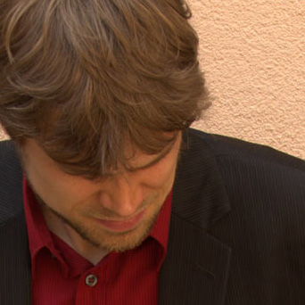
Many of you probably remember the Kurofan website, which was online a little over ten years ago and was full of wonderful Kurosawa content.
The website’s creator Guillaume Le Nistour got in touch with me recently and sent us the following greeting card in the form of some screenshots that he has colourised. (Click the image to see a larger version.)
I think that it’s a fascinating exploration of what these films could have looked like in colour.
The screenshots, by the way, were taken from VHS tapes. That’s another blast from the past! How lucky we are these days with Criterion, BFI and the rest.